# Dashboards
Dashboards can be composed automatically or manually. On every dashboard you can add one or more visualisations, such as a tile with a value, a line chart or a bar chart.
The configuration differs per visualisation and always requires selecting one or more queries containing the data you want to display.
You can add the same query several times and select different filters. For example, you can show the meter reading of two devices on a single visualisation. This gives you the flexibility to tailor the information on the dashboard to your specific needs.
# Tabs
A dashboard always consists of several tabs, of which the first one is shown first. Tabs are used to clearly separate different ways of visualising data, or to restrict access to certain data. A tab can be available internally only (for employees) or publicly (for contacts), the icon in front of the tab name shows which. This way you decide yourself which data you want to share.
To view all tabs, click the tab icon next to the name of the dashboard. An extra bar with the different tabs then appears. You can change the order by dragging the tabs, so that a different tab becomes the first one you open.
A tab can be deleted by clicking the three dots and choosing 'delete'.
# Filters
# Content
At the top left you can review the content filter, which shows what the queries are applied to, e.g. a specific project or device.
# Time filter
At the top right you can apply a time filter to the data being queried.
By default this applies the past 24 hours or week (organisation setting). The following standard relative filters are available as well:
- Past year
- Past month
- Past week
- Past 24h
- Today
- Tomorrow
- This week (Mon-Sun)
- This month
It is also possible to set an absolute from and to moment.
# Types
# Public
This tab is publicly available to all users with the internal roles administrator, manager and employee, and the external roles responsible and guest.
# Internal
This tab is available internally to all users with the internal roles administrator, manager and employee. Protected: this tab is private and restricted to the user who created it.
# Automatically created
This tab is created automatically and always generates a dashboard based on the linked measurements and their settings. This tab is available to users with the internal roles administrator, manager and employee who have the rights to create new dashboards. It serves as a starting point for new dashboards and will be saved as a new tab after your changes.
# Dashboard templates
Users can create and save multiple dashboard templates for future use. Every template can be named and edited as needed. Templates can be linked to specific job types or variants, which allows customised dashboard settings based on the job type. At the start of a workflow, users can select a suggested template or choose from the available templates, which allows a dashboard to be created quickly. Templates support dynamic filters and variables linked to the corresponding job type, which allows automatic configuration based on job-specific settings.
# Creating a dashboard template
- Go to the dashboard section and click the pencil at the top right
- Select an automatically created tab
- Configure the dashboard settings as desired and click the save icon
- In "New dashboard" you can set a name and choose to save the dashboard as a template.
# Duplicating a linked dashboard for one object
A dashboard template can be linked to several objects of the same type, for example several projects, companies, assets, asset types or job types. All of those objects then share the same template. If you change a tile on the dashboard of one object, for example the title or the scale of the y-axis, that tile changes everywhere the template is linked.
If one object needs a different variant, first duplicate the template and adjust the copy. There is no separate "Duplicate" button: you create the copy through a new dashboard that starts from the existing template:
- Open the object's dashboard, for example a project, and click Add/link dashboard.
- Choose Create new dashboard.
- Enter a name and, under Type, choose the same object type as the template, for example Project. The list in the next step only shows templates of that type.
- Under Start from, select the existing template instead of "blank". The platform copies the complete content, with all tiles and settings.
- Save. The copy appears as a new tab on this object.
The copy is linked to this object only. Changes to its tiles now affect only this variant; the original template and the other objects remain unchanged. If you later want the same variant on other objects, link the copy there with Link dashboard.
TIP
Name the variant and the original template so that the difference is clear, for example by including the unit or the variant in the name. A colleague linking a dashboard then picks the right one immediately.
# Printing and saving as PDF
A dashboard can be printed or saved as a PDF using the print button at the top right (printer icon). The platform prepares a print view for this: the navigation, the toolbar and the action buttons are hidden and the visualisations are placed one below the other, so that every tile fits on the page.
The actual printing is done by your browser. In the print dialog you select your printer or Save as PDF under Destination.
Enable 'Background graphics'
Charts, colour fills and background colours are treated as backgrounds by the browser. If that option is switched off, those tiles remain empty or blank in the PDF, while for example the logo and the map are still visible.
So enable the option in the print dialog:
- Chrome / Edge: More settings -> tick Background graphics
- Firefox: More settings -> Print backgrounds (colors and images)
- Safari: tick Print backgrounds
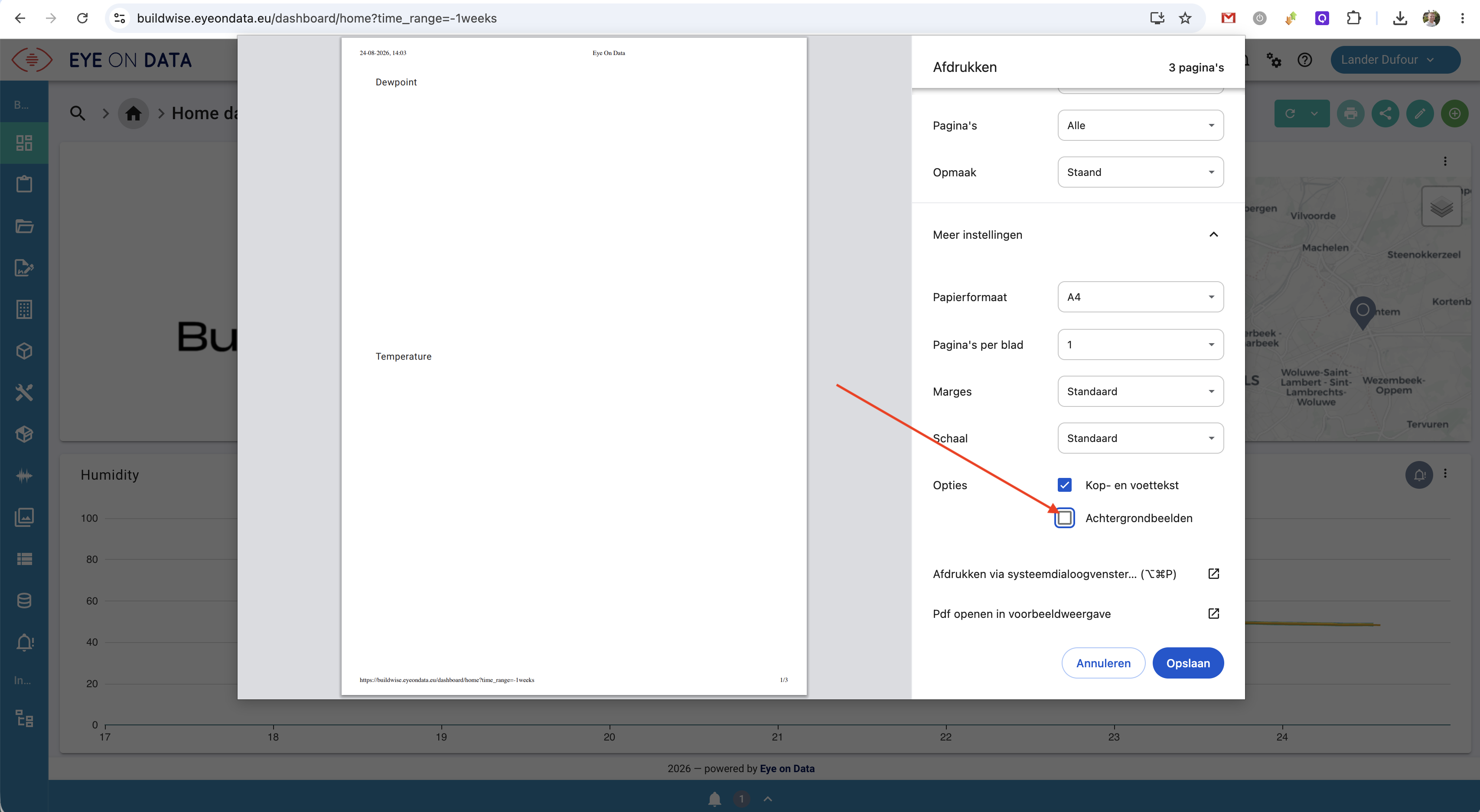
This setting is a choice made by the user in the browser; the platform cannot enforce it. Your browser does remember your choice for subsequent prints.
# Tips for a good-looking print
- Set the desired time filter first: what is shown on screen is what gets printed.
- Wait until all visualisations have fully loaded before clicking the print button.
- Choose landscape for wide line charts.
- Turn off Headers and footers if you do not want the URL and date on the page.
- For a recurring, formatted PDF you are better off using a report: it is generated by the platform itself and can also be e-mailed automatically.
# FAQ
# Why do I see a 403 error message when I open a dashboard?
This error indicates that access to the dashboard was denied, which means the user does not have sufficient rights to view this specific dashboard. This can happen because the user is not linked to the project, or because the dashboard may not be available for your specific user role and is only accessible internally, not publicly.
We recommend contacting the administrator of your platform to set the rights correctly and to resolve any problems with access to the dashboard.
# Why is my chart blank on the printed PDF?
Charts are treated as background graphics by the browser. If the Background graphics option (Chrome/Edge: under More settings) is not ticked in the print dialog, the browser leaves them out and you get a blank tile, while the logo and the map are printed.
Tick the option and print again. See Printing and saving as PDF.
# Visualisations
# Value
The value is a compact visualisation of one measurement, typically the last received value.
# General
- Icon
- Title
- optional information
- Hide for: roles for which this visualisation should be hidden.
# Data
- One query whose data you want to visualise
- Connect interrupted values: when active, lines will always connect all points.
- Display: choose between the value or the moment in time
- Fixed filters: allow you to filter on extra fields on top of the query. This makes it possible, for example, to define a query once and use it on several visualisations, each time filtered on a different device.
- Value can be set: allows a setting to be sent. This can be internal, or a value that can be sent to a device. A number of fields need to be configured for this.
# Display
- Background colour
- Text colour
- Hide action buttons for a compact appearance
- Optionally show the moment in time, measurement, device, owner name and description.
# Gauge
The gauge allows the data of one or more data series to be visualised.
# General
- Icon
- Title
- optional information
- Hide for: roles for which this visualisation should be hidden.
# Data
- One or more queries whose data you want to visualise
- Fixed filters: allow you to filter on extra fields on top of the query. This makes it possible, for example, to define a query once and use it on several visualisations, each time filtered on a different device.
# Display
- Background colour of the circle
- Font size of the legend
- Optionally show the moment in time, measurement, device, owner name and description.
# Table
The table allows the data of one or more data series to be visualised.
# General
- Icon
- Title
- optional information
- Hide for: roles for which this visualisation should be hidden.
# Data
- One or more queries whose data you want to visualise
- Fixed filters: allow you to filter on extra fields on top of the query. This makes it possible, for example, to define a query once and use it on several visualisations, each time filtered on a different device.
- The column name can be adjusted
- Display: value, chart or moment in time.
# Display
- Default number of rows per page
# Line chart
The line chart visualises the historical values of a query, with time on the X axis and the scale on the Y axis.
# General
- Icon
- Title
- optional information
- Hide for: roles for which this visualisation should be hidden.
# Data
- One or more data series or queries whose data you want to visualise
- Colour: colour of the line
- Connect interrupted values: when active, lines will always connect all points.
- Fixed filters: allow you to filter on extra fields on top of the query. This makes it possible, for example, to define a query once and use it on several visualisations, each time filtered on a different device.
# Chart
- Legend: none, or a legend at the top with the name of the data series
- Show: display measurement, device and/or owner in the info field.
# Water level
The water level tile visualises the current water level, the desired water level and various heights.
# General
- Icon
- Title
- optional information
- Hide for: roles for which this visualisation should be hidden.
# Data
- Water level query whose data you want to visualise.
- Desired water level query whose data you want to visualise and set.
- Zero level: height difference between the top of the standpipe and the zero level
- Installation depth: negative value of the sensor head relative to the top of the standpipe.
The zero level, desired water level and installation depth can be set on the tile.
TIP
Note that the installation depth has an impact on the water level, since it is used as an offset to calculate the water level. For example, if the level sensor measures 1.5m of water (above the sensor head) and the installation depth is -5m, the water level will be -3.5m. In addition, the installation depth is also used as a factor to send the desired water level as a percentage to the level control (frequency drive).
To make a setting (in %), two other parameters need to be entered:
sensor depth, e.g. -5m target depth, e.g. -4m => calculated automatically: 1 - (target depth / sensor depth) e.g. 1-(-4/-5) = 20% -4 = 20% -4.25 = 15% -4.5 = 10% -4.75 = 5%
# Chart
- Legend: none, or a legend at the top with the name of the data series
- Show: display measurement, device and/or owner in the info field.
# Liquid
The liquid visualisation shows the last value of a query as a percentage. The visualisation supports values between 0 and 1 and shows an error message when the value falls outside this range.
# Profile
A profile view shows a status per time block on the X axis by colouring in the block. These colours are defined in a list of possible values.
# General
- Icon
- Title
- optional information
- Hide for: roles for which this visualisation should be hidden.
# Data
- One or more queries whose data you want to visualise
- Fixed filters: allow you to filter on extra fields on top of the query. This makes it possible, for example, to define a query once and use it on several visualisations, each time filtered on a different device.
# Chart
- Legend: none, or a legend at the top with the name of the data series
- Show: display measurement, device and/or owner in the info field.